A Study in Subtlety - Unveiling the Layered Meaning of a Gray, Black, and Green Abstract
While some abstract art pieces overwhelm with a riot of color, others captivate with a more restrained, yet equally powerful, palette. This painting, the Gray - Black - Green Abstract Art for Industrial - Style Office & Modern Art Gallery SC220, is a masterpiece of subtlety and controlled emotion. It is a work that speaks in a language of texture and deliberate color placement, creating a sense of tension and balance. As a noteworthy piece in the collection of Gray Abstract Art, it showcases how a limited palette can create immense depth and narrative.
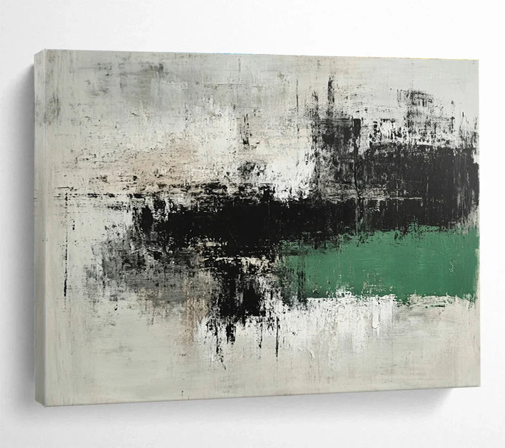
The canvas is a study in layered complexity. The dominant background is a field of textured, off-white and various shades of gray. The paint is applied with thick, heavy strokes, creating a rugged, almost weathered surface that feels like an old, industrial wall or a concrete slab. The artist’s use of impasto here is a key element, giving the artwork a raw, tactile quality that invites the viewer to look closer and appreciate the nuances of the surface. Streaks of black and dark gray are applied over this lighter background, creating a sense of decay, shadow, and urban grit. These dark, gestural marks evoke a feeling of an old photograph or a rain-streaked window, blurring the line between physical object and memory. The use of this limited, somber palette is reminiscent of artists like Gerhard Richter, whose work often explores the relationship between painting, photography, and memory, as detailed on the Tate Modern website's pages on photorealism.
The most striking element of the painting is the bold, horizontal bar of vibrant green that cuts across the lower part of the canvas. This is not a gentle, grassy green, but a rich, almost electric shade that feels both artificial and organic. This pop of color is a powerful counterpoint to the more muted, somber grays and blacks. It introduces a sense of newness, growth, or a sudden burst of life within a seemingly desolate landscape. The green stripe is not perfectly clean; it is rendered with a slightly distressed, hand-painted texture, as if it is struggling to assert itself against the dominant gray. The juxtaposition of the gritty, industrial feel of the grays with the vibrant, hopeful green is the emotional core of the painting. It is a dialogue between urban decay and the resilience of nature, or a moment of clarity and life emerging from a state of uncertainty.
The composition’s strength lies in this balance. The horizontal green bar provides a visual anchor, grounding the more chaotic, vertical brushstrokes of the black and gray above it. The painting feels like a distilled moment of a city's life—the starkness of concrete and steel interrupted by a flash of street art, a patch of grass in an alleyway, or the reflection of a neon sign on a wet street. The artwork’s ability to evoke these powerful, yet non-specific, images is a testament to the artist's masterful use of abstraction. For more on the role of color in conveying emotion in abstract art, a resource like the Metropolitan Museum of Art offers great insight.

The Artist's Vision and Journey
The artist’s creative journey is one of minimalist expression and the power of a single, well-placed element. Their work is a deliberate move away from representational art to focus on the essential components of a piece: texture, color, and form. The artist's philosophy is that a painting doesn’t need a complicated narrative to be emotionally resonant. Instead, it can rely on the simple, yet profound, conversation between different elements on the canvas.
The creative process is often a slow and meditative one. The artist begins with the subtle layering of grays and blacks, building up the texture and the sense of a weathered history. This phase is about establishing a foundation, a backdrop for the main event. The application of the green is the final, decisive act. It is a moment of spontaneous, yet carefully considered, placement that breathes life into the entire composition. This process is reminiscent of the philosophies of abstract artists who believe in the purity of form and the emotional weight of a single color, a topic explored in depth in publications by institutions like the MoMA.
The artist’s journey has evolved from working with more traditional media to focusing almost exclusively on textured, abstract works. This shift was a response to a desire for a more direct and uninhibited form of expression. This piece, with its powerful use of contrast and its evocative textures, is a perfect embodiment of that journey and a statement on the beauty that can be found in simplicity and juxtaposition.

Customer Reviews
"I was looking for something unique for my office, and this painting is perfect. The colors are very sophisticated, and the green adds just the right amount of a pop. The texture is incredible." - Alex M.
"This piece is amazing. It has an industrial feel but the green stripe makes it so modern and fresh. I love the way it looks against my white walls." - Samantha P.
"The quality is excellent. It feels very substantial and high-end. The abstract design is so versatile and works great in my living room." - David K.
Frequently Asked Questions (FAQ)
Q: Is this an original painting or a canvas print? A: This artwork is a high-quality reproduction of an original painting. The unique texture and layering of colors are meticulously recreated to provide a visually and tactilely rich finished product.
Q: How do I clean and care for this textured canvas? A: We recommend cleaning this painting by gently dusting it with a soft, dry cloth or a feather duster. Please do not use water, chemical cleaners, or abrasive materials, as they could damage the textured surface.
Q: Does the painting come with hanging hardware? A: Yes, all our canvases come with the necessary hardware pre-installed on the back, so it is ready to hang as soon as it arrives.
Q: Can this piece be hung in a room with a lot of natural light? A: The canvas and inks are made with high-quality, fade-resistant materials. However, to ensure the longevity of the vibrant colors, we recommend hanging the artwork in a location that avoids constant, direct sunlight.
Q: What is the best way to light this painting to show off the texture? A: A single-source light, such as a spotlight or a track light, positioned to hit the canvas at an angle, will beautifully highlight the textured brushstrokes and the subtle layers of color, giving the painting a dynamic, three-dimensional quality.